Our friends over at The Art of The Title have been inspiring us for years with incredible in-depth interviews of some of our favorite title sequences in film and TV shows. I think that we can all agree that a film’s title sequence will not make or break the film on its own, however it can act as a great contribution to set the mood and pace of the film. We keep mentioning that in short films, grasping your audience quickly is a must if you want to keep them hooked, so it got us think about the Art of the Title in short films.
Firstly, do short films even need or deserve a title sequence?
In short, a title sequence is not needed in shorts, since most films are not produced by major studios or have contracted major stars through agencies with demands of having their name come up first. The title sequence becomes a contractual obligation for the studios, and a reminder to the audience of who created the film and who will be starring in it.
Let’s face it, in a short film nobody will recognize the director’s name or starring roles besides your friends and family, unless you were able to get a renown name in your credits. The title will also not make or break your film, but all this being said, even though it doesn’t bring much to the film’s story or production, it still looks pretty damn cool!
Showing off some skills
People love it, and people love making them. As we’ve mentioned before, creating a title sequence is an art of its own, and when working on their own film, filmmakers tempt to go all out.
Here are some great examples of beautiful opening title credits in short films.
Kensho
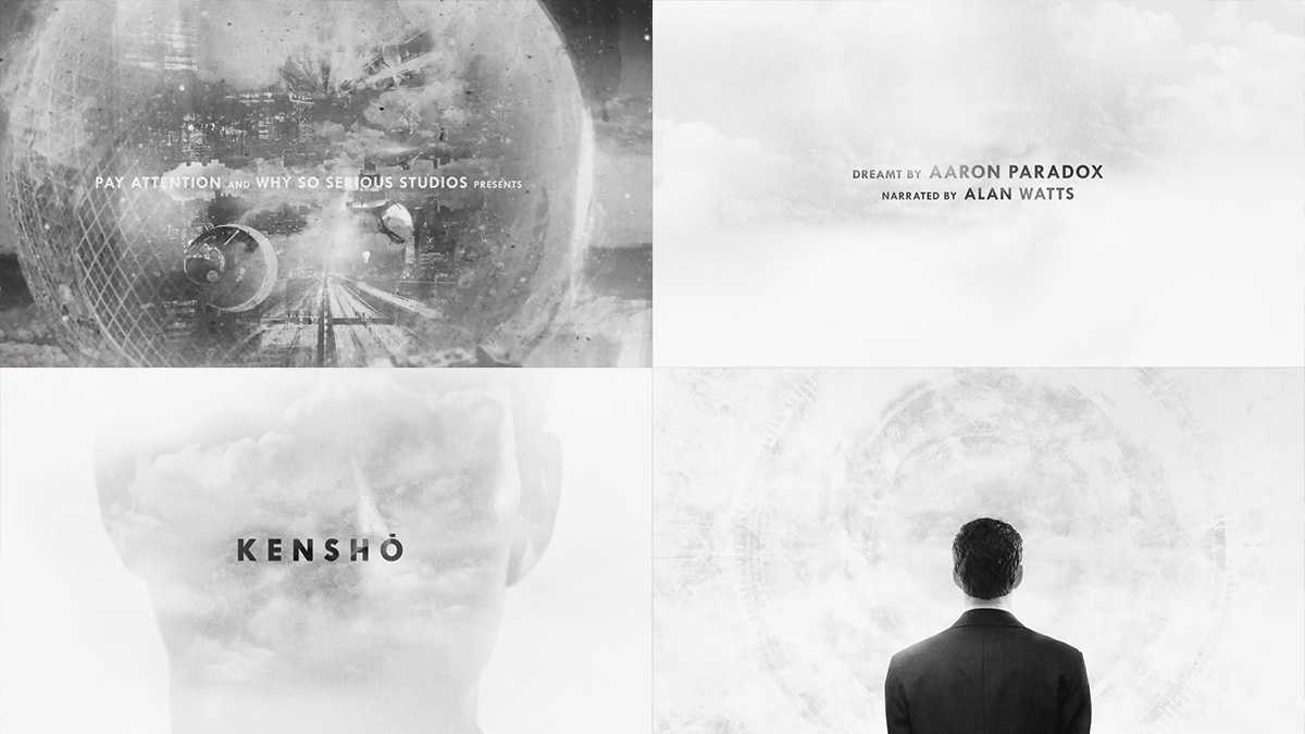
Kensho is an aesthetic masterpiece from beginning to end, and the opening sequence is just the beginning of it. Starting with quick scribbles and scratching methods under the merciless screams of the now infamous Double Rainbow Guy, hypnotic and geometrically shaped images of historical elements, cities and people frantically and continuously zoom out until an harmonious title starts moving in through clouds masked inside a human head silhouette.
Credit: Aaron Paradox / Director – Designer
Sundays
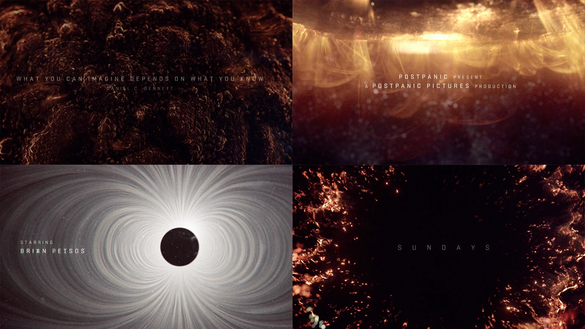
The Sun burns strong in this most impressive and over the board title sequence. This sequence sets up the beginning of a near future apocalyptic storyline, with incredible combination of up close sun flaring visuals with telemetric imagery. The strong flares take out many of the worlds satellites, transitioning to the chaos it creates on Earth. Certainly one of the most ambitious opening sequences we’ve ever seen for a short film, and definitely convinces us to glue our asses to our seats for the entire film.
Credit: Mischa Rozema / Director — Ivor Goldberg / VFX Supervisor
Devil Makes Work
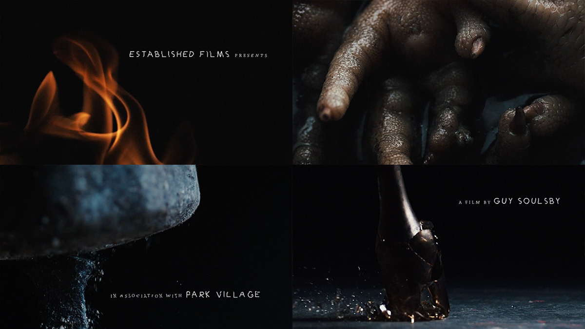
Something devilish is going on. Flames take over the screen, rich red blood-like substance slowly drips onto soil and chicken feet dampen in a dark substance. The beautiful art of macro and slow motion sets the grueling pace to this film, as good and evil collide in a biblical montage of flesh and steel set to a terrifying soundtrack by Seb Juviler.
The concept of the film is about good and evil, heaven and hell, so this needed to be conveyed in the opening titles. I wanted to make the titles abstract, filled with imagery that was original but also connected to the characters, so they have a meaning. There is dripping blood, writhing maggots, crucifix’s, twisted chains, and the more bizarre, boiling chicken’s feet in black tar. The high-speed macro approach enabled us to capture so much more detail than you wouldn’t normally see, such as the amazing shot of the Sacramental bread as it snaps in two and tiny particles scatter into the air.
-Guy Soulsby, DIRECTOR
Guy maximised the powerful slow motion medium to produce a stunning opening sequence to his film. Together with beautiful lighting and macro photography, the slow motion aspect was well used to set a dramatic and powerful mood. We shot a wide variety of weird and wonderful props, it was great to be able to experiment and the slow motion brought some surprising results to some interesting subject matter.
-Stephen from LOVE HIGH SPEED
Credit: Guy Soulsby / Director — Stephen Price / Love High Speed — Seb Juviler / SNK Studios / Composer — Tom Langton / Found / 2D Text — Nicholas Bennett / DOP —
Noam Piper / Production Designer
Shotgun
Just as wild as the film, the Shotgun title sequence introduces the three rebellious main characters through a pacy montage of photographs following the upbeat metal roar soundtrack. You know you’re in for a wild ride.
Credit: Maverick Moore / Director
Death By Chocolate
A delightful crop montage to match the cheery and pleasant tone of the film, despite its deadly intentions. The title sequence introduces baking of a sweet chocolaty dessert in synchronous panels broken up by sharp yellow titles to contrast the black background. Leaves you hungry for more!
Credit: Dimitri Gochgarian / Director
Knives
All about camera composition, with a simple 90º tilt and a great play on the rule of thirds. While introducing the main character and his teenage laziness, a neat retro typeface fills in the negative space matching the grainy style of the film. Not a groundbreaking visual opening sequence, but a simplistically smart one.
Credit: Aaron David DeFazio / Director
Foxes
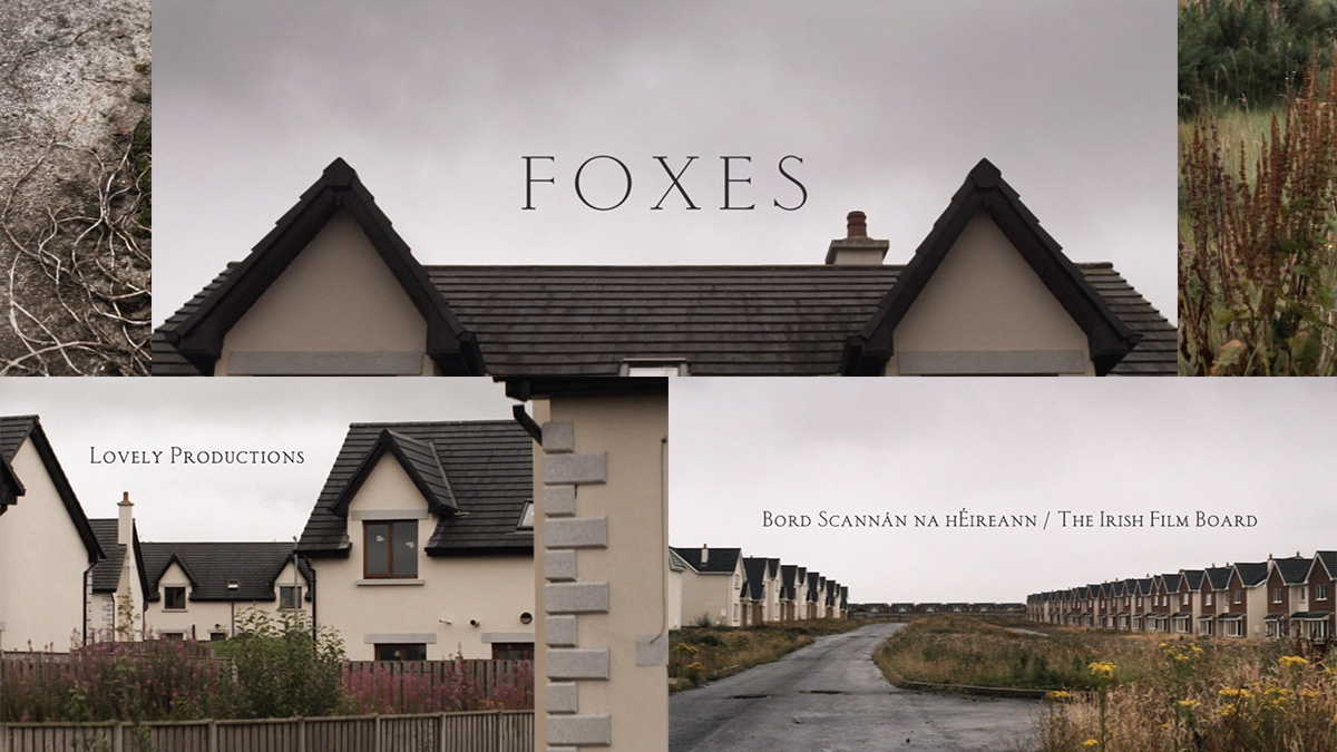
An example that simplicity can go a very long way. The story of Lorcan Finnegan’s ‘Foxes’ revolves heavily around a remote estate of empty houses, and the title sequence simply introduces the eerie town with long, empty shots of a cookie-cutter home neighborhood. The titles smoothly fill up the quiet grey sky space shot after shot, to ingeniously finally reveal the film title with a head-on shot of a fox-looking rooftop.
Credit: Lorcan Finnegan / Director
Crazy Like Me
Crazy visual effects with motion graphics are not always the answer for a memorable title sequence. Crazy Like Me uses space and dramatic timing to build up the if the film, with simple white typeface over the light blue water of a swimming pool.
I wanted to open the film on a long single take underwater that immediately set the tone of depression and solitude. I liked the idea of using the opening titles as a way to signal to the audience that this is our main character’s mindset, which was especially impactful with the original song from my composers, but also the way the camera slowly moves in on the main character’s face -literally showing that this story is going to take a closer look at a person who feels completely alienated and alone.
– Leah McKissock, DIRECTOR
Credit: Leah McKissock / Director
43,000 Feet
The off-black shows immediate attention to detail, a simple film commission mention followed by a mosaic of random images builds up the title of the film. We promptly zoom in to reveal a close up of the main character John Wilkens introducing himself as a statistician.
Credit: Campbell Hooper / Director
Stanley Pickle
As colourful as the film itself, this sequence introduces the playful and mysteriously mechanical nature of the film. Again, based on captured imagery rather than motion effects.
We had a stills camera on a manual track, it was wound a specific distance for each frame captured. We used dragonframe stop motion software. All the props I collected were laid out on the floor, they all had specific connotations to childhood and Stanley’s life inside his house. In the wide shot you might be able to spot a miniature stop motion armature puppet of Stanley made by Keaton Henson and myself from when we first conceived the idea.
After I set up the props, the cinematographer John Lee set up two gels either side of the set, one orange and one blue and a soft light to make the shadows less harsh. (He had a broken leg while doing all of this)
The composer jean-Marc Petsas recorded singer Melanie Pappenheim (who has worked previously with Jocelyn Pook on Eyes Wide Shut) singing an eerie clockwork intro that lead us in to the first scene of Stanley at the breakfast table.
– Vicky Mather
Credit: Victoria Mather / Director


