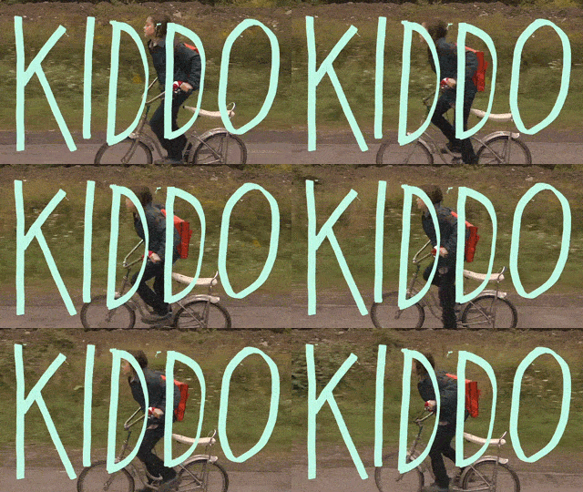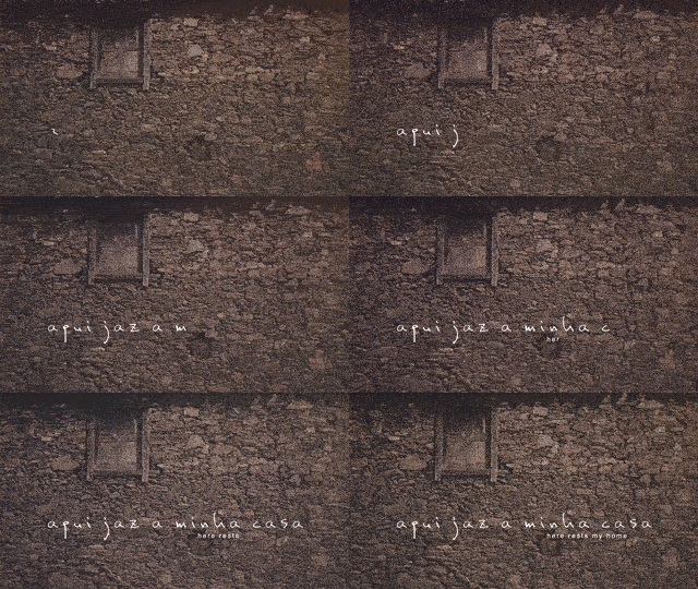
Nowadays short films will usually end up online sooner or later, if not immidiately. With the web becoming a much more competitive ground for shorts, filmmakers need to produce their films with this in mind from the beginning. We are far away from the closed up theater with nothing but a big screen and blasted audio, so a filmmaker’s biggest opponent online becomes a viewer’s attention span, since any little distraction can take them away from you.
Most films online will lose their viewers within the first 15 seconds, making the first impression ever so crucial. So how do you keep people hooked when the first 15 seconds is usually a title screen? Blow them away with an awesome opening title!
A Little History of The Title / Typography
The history of typography is one that dates back almost 3800 years. In recent decades it has become a crucial part of filmmaking, evolving over the years with the trends and fashions of the era, giving the films their own moment in time. This is something that lots of short filmmakers have embraced, but still overseen by so many others, especially in lower budget films. Julia May from Smashing Magazine wrote this awesome article on The Art Of Film Title Design Throughout Cinema History, where she talks about and more importantly shows you the style evolution throughout the years.
Film titles can be great fun. In them we see the bond between the art of filmmaking and graphic design — and perhaps visual culture as a whole. They have always served a greater purpose than themselves: to move the overarching story forward.
-Julia May for Smashing Magazine
A nice attractive font can make an entire difference on a film, bringing it from an amateur level to professional. But be careful, what you might think is cool could be ridiculed by others, so make sure to seek a professional designers’ help with this. Check out Creative Fabrica for this awesome free font generator!
A good title will give your film some credibility and life to begin with. Viewers recognize these efforts and even though they might not say anything about it, they do engage to it. The title sequence usually sets the tone for the rest of the film, so if some quality work is put into the title, the same effort will usually follow in the film

Iconic Fonts You Should Never Use
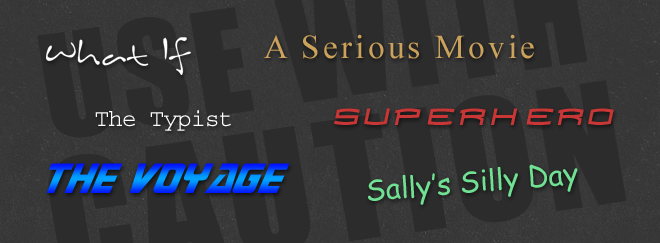
There are certain fonts to avoid when designing your title to prevent a catastrophe from the beginning. Default fonts like Times New Roman, Courier and Comic Sans need to absolutely be avoided. Other fonts like Inkburrow seems to be everyone’s favorite, it was my favorite back in 2005 when I used it for my film ‘What If‘, but since then I seem to see it every 3rd short I see. There are thousands of fonts available freely online so it’s easy to choose something that is similar but not as popular.
Something else that needs to be avoided at all costs, is to have the exact font as an obvious Hollywood film, like Spider-Man or Star Trek. People will quickly recognize the title from somewhere else and would say it was ripped-off.

Simplicity
There is no need to go to Hollywood levels to create a good title sequence, most of the time just choosing the right typography and color with a nice background would be enough to leave people hooked. A simple fade in or even a mask wipe can work wonders, just get your speed right, you want it to look natural with the visuals and especially music playing during the titles.
Effects
Keeping it simple is the easiest solution and perhaps the best solution for certain types of films. But short films are means for artists to show off and they usually do no less with the titles, in fact it’s an opportunity to show off a different skill set in graphic design and video editing, and they tempt to go a little crazy with them. But hey, if your able to knock our socks off with a title screen, by all means go for it!

Branding Your Film
One thing to keep in mind throughout editing is to treat your film like a brand. Your title sequence should match your film’s style and feel, as it usually sets up the mood for the movie. Choose a suitable theme and style from your first posters, and try to maintain the look into you opening title sequence, and throughout the film up to the rolling credits.
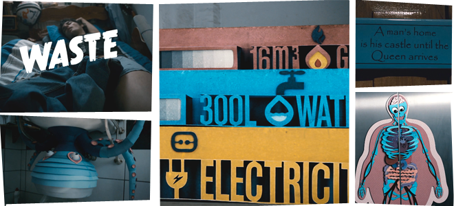
A perfect example for film branding is the short Waste by Anton Groves. With a surreal colorful feel explored through the paper cutout monsters, the films brand runs though the entire 7 minutes.
Your film needs some credibility, and one way of convincing people is through the titles of the film. Convince them to stay, and then your cinematographer skills will do the rest. Unfortunately your film might not get much visibility solely on titles, but a good film needs a wealthy presence of titles and introduction to fulfill the full experience.
Enjoy your filmmaking, and don’t forget to visit ArtOfTheTitle.com and our own wonderful bank of short films for some inspiration on titles!


