As you may have noticed last week, Film Shortage looked a little different with an all new design update. Sometimes people can get scared of change, but we’re here to tell you that there’s absolutely nothing to worry about – every single change has been made with you in mind.
What’s New?
New Logo
We kept our recognizable icon, but just added a modern lively touch to the colors. The font got a refreshed update as well, with a smoother cursive that’s a little easier on the eye. Don’t have a designer? Check out Adobe’s logo maker to make your free logo.
A video posted by Film Shortage (@filmshortage) on
New Design
First and foremost, we cleaned things up. We grabbed the essentials and focused our design around that. Less clutter, bigger images and clearer text. With the new logo we brightened up our colors and rebranded the site as well. As our original intent was to be very colourful, we now decided that the colors should come from the films themselves and not have the site around distract from that. By reducing the amount of colors in our palette, your eyes will quickly be drawn to the right content first.

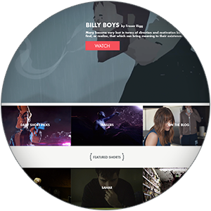

Featured shorts are now real features. The headlines now take on a magazine-style cover on the homepage, with their personal full-width feature page giving a bigger focus on the film itself. Click play and immerse yourself.

Same Structure, Better Experience
Responsiveness
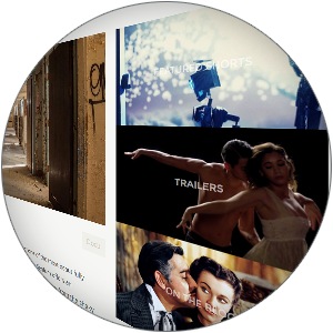
Although we still strongly believe these short films should be seen on the biggest screens possible, we’re all too familiar with the on-the-go mobile need for viewers. Our biggest changes came with the mobile experience in mind, and although our old site was mobile ready – there was certainly lots of room for improvement. We wanted to make Film Shortage feel like a native app on any device!
Pick up your phone and check it out!
You can easily add Film Shortage to your mobile home screen for easy access on the go!
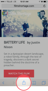
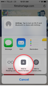
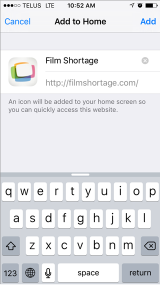
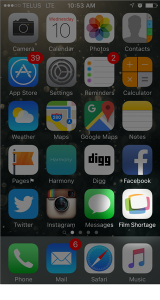
The changes are still new, so we want to know your thoughts! Will be working on some fixes here and there so please don’t hesitate to notify us if you spot unusual. Hope you enjoy it!


