For our next scene break we turned to some home talent and an underground comic book inspired film. Meet Santiago Menghini, a director, visual effect artist, co-founder of Nemesis Films, and founder of The Film Effect. Santiago is the craftful director behind the eerie short ‘Intruders‘, and we had a little chat with him and about the particlar scene ‘Jacov’ found between 2:00 and 5:30.
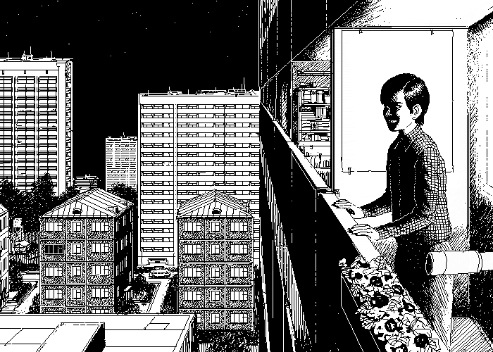
We know the ‘Jacov’ scene was inspired from one of Uno Moralez comics. Was the scene the entire comic, or did the comic have more background story?
Santiago: The scene was the entire comic. I tried to be faithful to the original material which was only 10 panels long but I did take certain liberties in my interpretation. Uno’s comic is a simple story told concisely – seeing it for the first time I knew almost instantly that it would make a fascinating cinematic sequence and did not require much to modify.
In my mind, the comic does have more of a background story but nothing that drastically changes the core of Uno’s work. During my story development, I created a backstory which allowed me to loosely connect the other chapters of the film together.
You followed Moralez’s “storyboard” pretty closely, how much liberty did you give yourself to make changes or add shots?
Santiago: I gave myself a lot of liberty in the construction of the scene. I didn’t feel obligated to the original material but did want to respect it. If needed, I would change, remove, or alter certain actions to suit my production and narrative requirements accordingly.
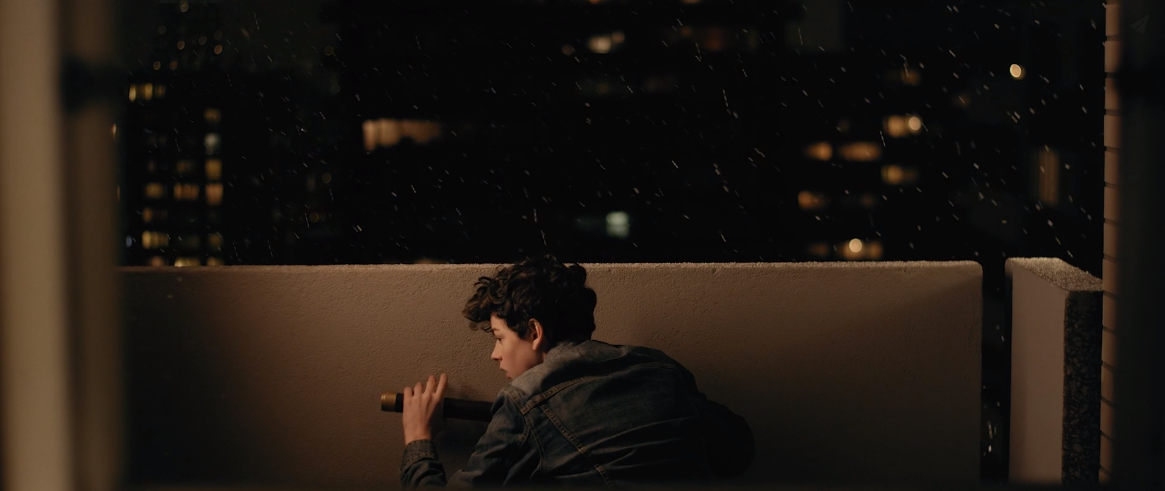
For example, the second panel in the original comic, Jacov is holding his telescope and smiling at it. I shot the panel almost exactly as designed but knew almost immediately while shooting that I wouldn’t end up using it! Something in the composition, action, and timing didn’t fit the needs of what I sensed in the buildup of the scene. We need to get moving as well as find a more interesting way to get into the charters psychological state.
So I did a long track towards Jacov at his desk instead – played with the window curtains and used sound to be our gateway into his head (rather than relying a mischievous smile). I keep the insert of the telescope opening and with that – I introduced my protagonist and his inciting action tool. Time to move on – no need for a reaction shot of his face – aka. – panel two.
The setting in the scene is relatively simple, is there any reason why the entry shot was done in CG?
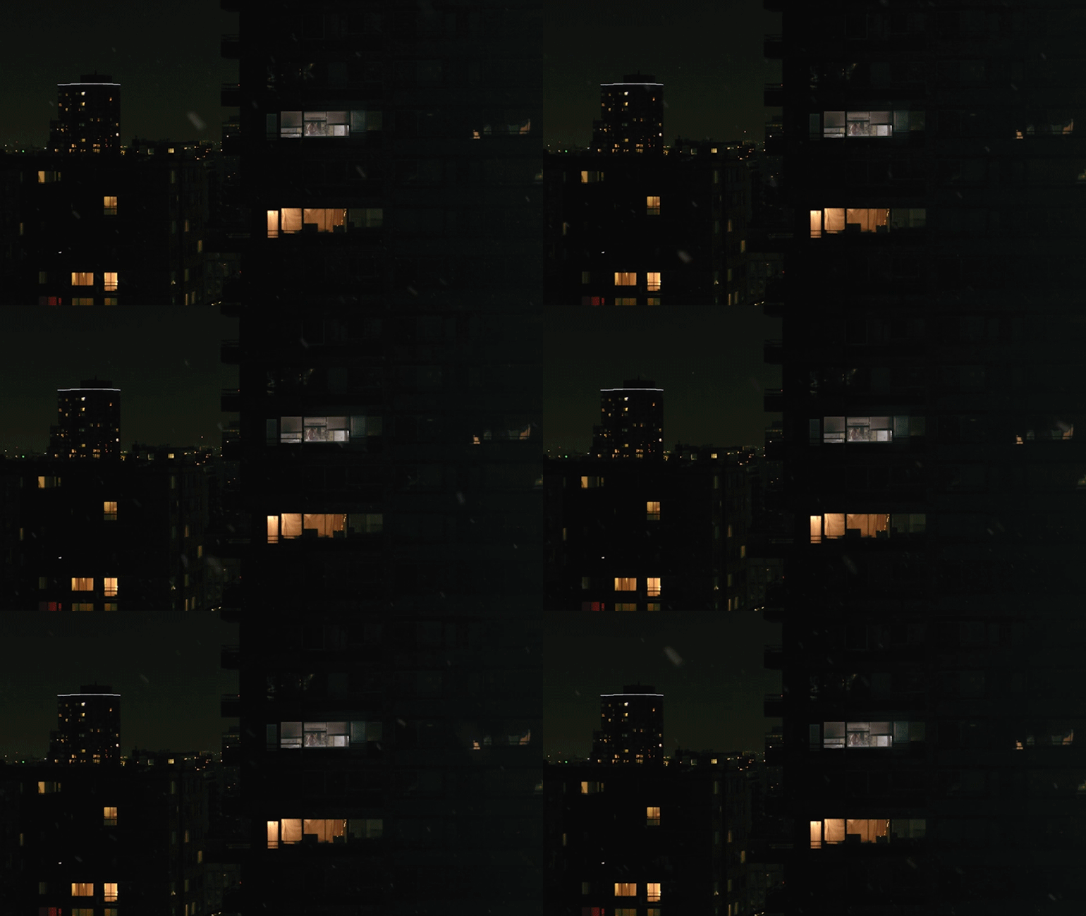
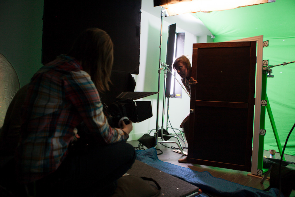
Santiago: The entry shot was done partially in CG because I wanted the demon woman to be BIG – eerily big. Not ridiculous but just enough to make you uncomfortable. So we constructed a miniature door, lowered the camera, put up a green-screen, and had our actress burst through the door. In post – we keyed out the green, tracked the shot, and build the room environment extension in 3D space.
We see the snow was not taken from the comic, was that an intentional aspect or just the burden of living in Montreal? Because it really does add a layer to the scene.
Santiago: The snow was an accident and a huge production headache, yet at the same time – it was also a gift from the cinema gods. During the filming of one of our master shots – the weather turned and snow started to creep in. At first – it seemed manageable but surely enough, the snow kept intensifying. At some point I had to make a choice – wait for the snow to clear or work it into the atmosphere. I chose to keep it but knowing it would come back to haunt me during post-production.
This is where my background in visual effects saved me, because it allowed me to concretely consider a solution to our problem. I had worked snow in previous work I have done and knew the scope of what was possible. Being on set – the consideration didn’t take long and I went thought with what Mother Nature was adding in production value.
A quick note in the process of creating the snow began by first tracking the camera movements in 3D space and the simulating snow particles to match. The thirdly step was to light the CG snow accordingly and then composite it into the shot. In total there were approximately 13 digital snow shots.
Tell us how you created the teen’s distorted creep walk at the end?
Santiago: The shot is actually all in the performance and edit. A big credit has to be given to Charles Sirard Blouin – he did an amazing job and understood exactly what I was looking for. Having the comic as reference was very helpful because visually the body language was clear. Along with this, I remember reading an article about the editing in the film 28 Days Later. For that film – they created crazy sporadic zombies that seemed to move in an aggressive and violent manner. In the article they described that with simple well placed jumpcuts the effect was created. I keep that in mind when directing Charles, telling him to treat his movements in snaps – along with the editing, this is how the teen got his distorted creepy walk.
Besides the creepy script, what were your technical tricks to make this seem nightmarish?
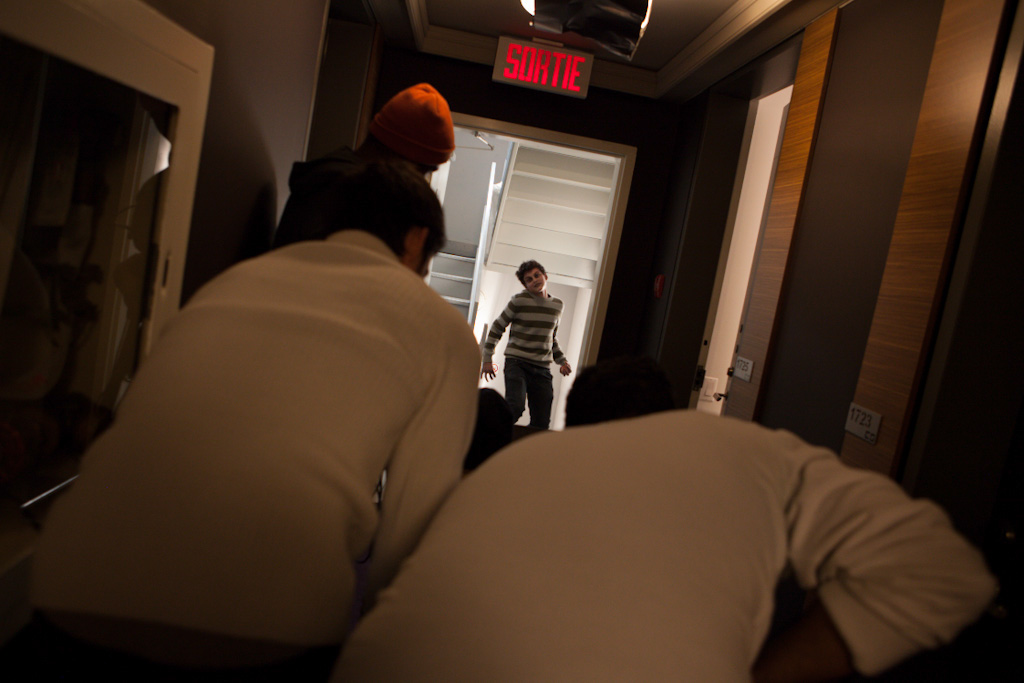
Santiago: This is a hard questions to answer – so I’ll just try to mention a few elements that come mind. I’ll attempt to center my comments to the creep factor. The use of silence was an important technical element I played with in this film. I made sure to hold on the music instead of indulging and relaying on it to tell my emotion and tonal feel. Music can me misused – especially in horror films. Personally, I think knowing when to hold, even when the action picks up, is key to an effective uneasy nightmarish atmosphere. In essence, I would delay the horror beat – let the visuals speak for themselves and follow up with a build instead of a SCARE followed by a release.
Playing with expectations and distorting them was also another trick I used for this film. A clear example, is how the demon woman suddenly appears much larger up-close than in the initial introduction. Another example is right at the start of the Jacov chapter – the screaming wind. I intentionally wanted to hear screams right at the start of the sequence – alerting the audience that something was wrong – but then make them doubt and questions that very feeling because the scream turn out only to be the wind.
To create a creepy aesthetic – you need embrace the surreal. This could mean such things as externalizing the characters inner fears or presenting an impossibility in a physical manner. One such example is how the characters face turns red when the door opens. There is not physical motivation in the scene to cause the red light – instead it manifested from the characters internal phycology. It is important to allowing for moments when reality can break. A mix of reality and the surrealistic, is in my mind, what makes something unsettling, fascinating and creepy.
Another great trick is – find the right collaborators! People you can trust and have faith in creatively. For this film, the key creative crew members were my director of photography – Ray Lavers, my art director – Laura Nhem, and my Assistant Director – Pascal Plante. From the start I knew if I felt uncertain about any particular aesthetic and creative decisions I could turn to them for a second opinion. By my estimation – this trumps all the other ‘tips’.
What kind of camera did you use for this scene? Did you use any other particular equipment?
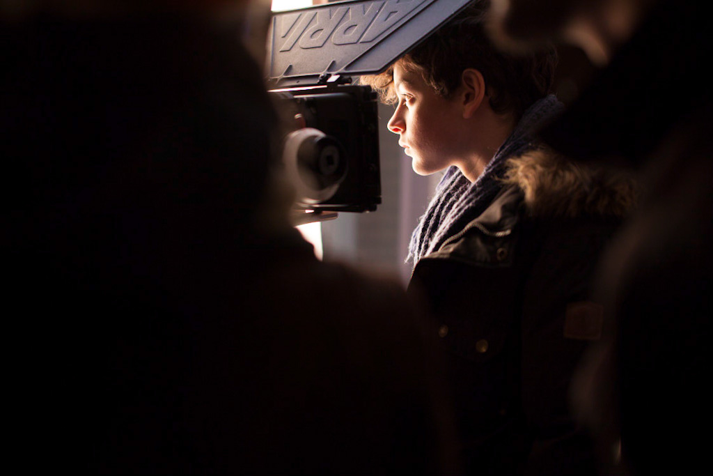
Santiago: We shot on the RED Epic-X with Ziess ZF lenses
. The only piece of equipment that might stand out form a usual cinema package is that we acquired a Nikon 600mm lens
for the shoot. We utilized the lens to shoot between both apartment buildings. The lens was quite enormous and impractical but did exactly what we desired.

Where did the visual inspiration come from? Were you tempted to create the film in black and white like the comic?
Santiago: In all honestly – the black and white aesthetic didn’t even cross my mind but your argument is very legitimate. Black and white film has a surreal element to it. Removing color – separates us from a core factor of our reality, meaning that a black and white version of Intruders could be very fitting.
Although, the reason I have chosen to go with color is because I wanted to use it as a visual element in my creative toolset. I also knew I could play with colors in a similar way to how black and white can affect a film. For example, sodium vapor lights have a very limited wavelength of color and produce a similar look to black and white, a type of destatured look. In the film you can notice that the city lights caused just that look. During color-grading, I forced it even further.
For visual inspiration – Uno’s work was my foundation. I was transfixed about what was it that made Uno’s art so unsettling and absolutely encompassing. I questioned this for months – researching and attempting to breakdown the core essentials. I wanted to be able to translate the impression I got when seeing his graphic work for the first time. It has taught me is an appreciation for subtlety, as well as a recognitions of the limitations and benefits of different mediums. Graphic art has a very unique aesthetic that doesn’t necessarily translate directly to live- action cinema but there are certain factors that do and I hope Intruders serves as an example.
How did you approach your lighting direction for this scene?
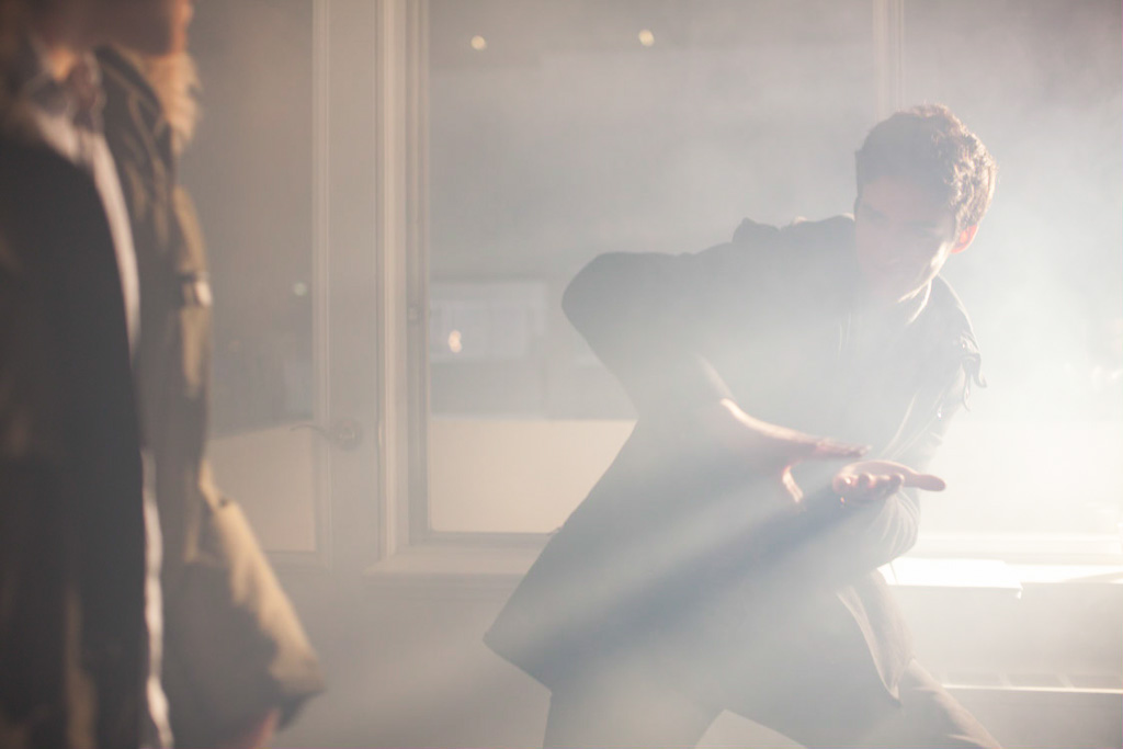
Santiago: Lighting-wise I told my amazing DOP, Ray Lavers, to keep the shadows toward the camera. I didn’t want strong frontal key lighting, instead I opted for backlighting and soft shadows. Aside from those points – I was clear to say – “keep it dark – but I still want my highlights”.
Santiago, we thank you so much for taking the time to break up your intriguing scene with us! The best part for everyone is that Santiago has an even more elaborate case study for the film on his site thefilmeffect.com, we urge you to go take a look and dig deeper into the entire process, it was quite a joy to read.


