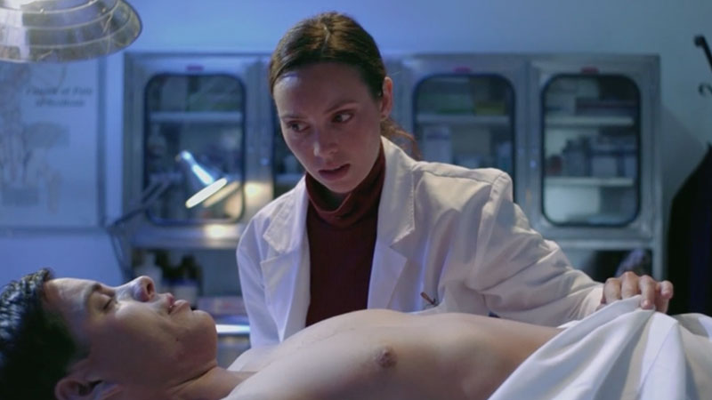
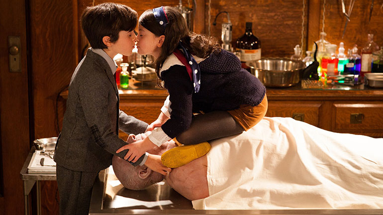
A young man guides his little sister through the inner workings of their family business: embalming dead bodies.
Learning the family business is never easy for a child, especially when it involves embalming dead bodies. Filmmaker and actor Dimitri Yuri explores one of the world’s most fascinating jobs in Falling Leaves. But if that is not enough, we experience it through a unique setting and situation. An older brother teaching his younger sister the inner workings of their family business. The film captures the essence of a brother-sister relationship with some raw comical puns – all within the morbid setting.
The Foundation of Falling Leaves
As morbid as it may sound, I don’t think I’ve ever written any story that wasn’t concerned with death. It is by far the theme that fascinates me the most: how can the most common thing in the world also be the most mysterious? It’s so odd that something that has happened to everyone before us (and will undoubtedly happen to all us) should be seen as a heavy, difficult subject. With that in mind, I wanted to write a story that demystified death, treating it as just another transition that happens in someone’s life. To me, a mortician’s perspective is an invaluable one, after all they see, touch, and process death every single day.
That was the foundation of the short: putting two conflicting perspectives on death together and making them figure out a temporary truth that satisfied both parties. From then on, the characters developed beyond simply being perspectives, the family relation between the brother and sister continuously became more important in the script, and then we eventually got Falling Leaves.
The Photography
Falling Leaves was shot with the Alexa Mini, always on sticks. Cinematographer Nissryne Dib and Dimitri discussed knew they wanted the film to be shot in black and white. They also knew they a static shot in an 1:1 aspect ratio. Although they later settled for 1.19:1 since 1:1 gave off too much of a vertical feel. According to Dimitri “this not only emphasized the idea of stillness and death, but it also made it more intimate, making it seem like the audience was getting a short glimpse into this private moment.”
Nissryne also worked on carefully crafting a variety of macro close-ups of the dead body on the table; the idea was to tell the story of this woman’s life through the details of her body (scars, tattoos, etc). And also to reference autopsy photography.
The lighting was almost entirely natural, something of which Nissryne is a big proponent. Everytime we turned on a light, something felt off. Our references were varied, but they included the films of Pawel Pawlikowski, the photography of Sally Mann, and Dutch Baroque paintings.


